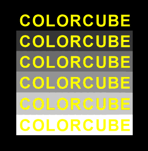
COLORCUBE - Return home

Contrast of Value

In order to maximize color recogition and text legibility, the goal is to find the optimal combination for the colors used. By varying hue, saturation and value, we can ensure good visibility with "highly contrasting" colors. The following display is an example of how different backgrounds affects our ability to distinguish colors.

Instructions: The text string below is repeated on a series of backgrounds with varying lightness. Which background is most favourable to the yellow text?

Which background is best?

Back to Optical Illusions

Other Illusions:
Blind Spots
Blink Effect
Bordering
Chromatic Adaptation
Color Blindness
Crispening
Dither Dots
Dithering
Fill Patterns
Opponent After-images
Optical Art
Shape Contrast
Simultaneous Contrast
Value Contrast

Other fun stuff:
Free 3D Screensavers
Color Playground
Dimensions of Color
3D Color Puzzle

The COLORCUBE website is sponsored by ImageMAKER Development Inc.
http://www.ConversionServer.com Convert Documents & PST files to TIFF, JPEG & PDF
http://www.Discovery-Assistant.com Electronic Discovery & Litigation Support Software
http://www.ImgPRINT.com Windows TIFF print driver
http://www.ImgMAKER.com Windows Fax print driver
Home Site Map Order Feedback      Copyright 2000-2018 © Spittin' Image Software, Inc. All rights reserved.     Back to Top